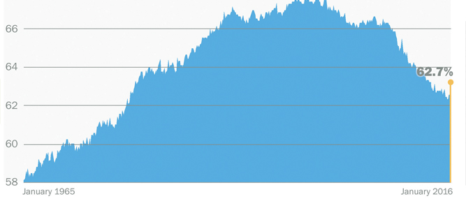
The accompanying chart was published on the www.money.cnn.com website 19 months ago to go with an article headlined, ‘Why doesn’t 4.9% unemployment feel great?’
The article noted at the time that the U.S. unemployment rate had just fallen below 5% for the first time since 2008.
Surely that was good news, right?
Well, even President Obama said at the time that there was more “to tackle.”
The graph shows one reason why the good news about the unemployment rate wasn’t cause for jubilation: fewer adults are working. That is, fewer adults are participating in the labor force. The labor force participation rate measures how many people over age 16 are working or actively seeking work.
Take a look at the far left of the graph; it starts at 1965. The participation rate was so low because fewer women worked outside the home, but it trended steadily upward as times changed.
The graph peaks around 1998-2000, then begins a precipitous decline around 2009 and the onset of the Great Recession. As of January 2016, it was at the same level as the 1970s — 40 years ago.
There are some ‘good’ reasons for the decline. One is that Baby Boomers are retiring, which is expected and healthy. That accounts for about half the decline.
Also, more young people are going to college and graduate school.
There’s one other contributing factor: some people quit looking for work, although the number is hard to quantify.
The Wall Street Journal estimated that about 2.6 million of the roughly 92 million American adults who don’t work want a job, but they are not looking for one.


